May 4 [correct link applied - makc]
Let's have some real images thanks ... I guess everyone has to have toys, though.
Stupid Composite Images (APOD 2008 May 04)
-
Sputnick
- Science Officer
- Posts: 458
- Joined: Thu Apr 10, 2008 7:18 pm
- AKA: Sputnick
- Location: Peterborough, Ontario, Canada
Stupid Composite Images (APOD 2008 May 04)
If man were made to fly he wouldn't need alcohol .. lots and lots and lots of alcohol to get through the furors while maintaining the fervors.

Re: Stupid Composite Images
It's more real than the camera could catch in a single image. By combining multiple images of the same event, the photographer was able to create an image that was more truthful to how he remembers the event, than any of those single images.
Does image stacking in amateur planetary astrophotography make Mars, Jupiter or Saturn less real? Or just more detailed?
Does image stacking in amateur planetary astrophotography make Mars, Jupiter or Saturn less real? Or just more detailed?
-
orin stepanek

- Plutopian
- Posts: 8200
- Joined: Wed Jul 27, 2005 3:41 pm
- Location: Nebraska
Re: Stupid Composite Images
Hi Sputnick! Is this the link you wanted?Sputnick wrote:May 4 http://antwrp.gsfc.nasa.gov/apod/astropix.html
Let's have some real images thanks ... I guess everyone has to have toys, though.
http://apod.nasa.gov/apod/ap080504.html
Orin
Orin
Smile today; tomorrow's another day!
Smile today; tomorrow's another day!
-
Sputnick
- Science Officer
- Posts: 458
- Joined: Thu Apr 10, 2008 7:18 pm
- AKA: Sputnick
- Location: Peterborough, Ontario, Canada
Oops - how'd I get the wrong url? Thanks, Orin.
John D - you and me agree about something!?!?!?!?!?!?!?!?!?!?!?! Marvellous. There really is hope that you'll come to see Phobo's crater grooves as being steam vent.
John D - you and me agree about something!?!?!?!?!?!?!?!?!?!?!?! Marvellous. There really is hope that you'll come to see Phobo's crater grooves as being steam vent.
If man were made to fly he wouldn't need alcohol .. lots and lots and lots of alcohol to get through the furors while maintaining the fervors.
-
orin stepanek
- Plutopian
- Posts: 8200
- Joined: Wed Jul 27, 2005 3:41 pm
- Location: Nebraska
You may have taken URL directly from APOD's daily link.Sputnick wrote:Oops - how'd I get the wrong url? Thanks, Orin.
John D - you and me agree about something!?!?!?!?!?!?!?!?!?!?!?! Marvellous. There really is hope that you'll come to see Phobo's crater grooves as being steam vent.
Orin
Orin
Smile today; tomorrow's another day!
Smile today; tomorrow's another day!

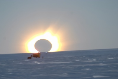
I'm not quite sure what the problem is. A sizable fraction of the images here on APoD aren't 'real', but I don't hear you complaining about them. Astronomically-useful images rarely resemble what the human eye would see. Take today's image of Saturn for example: it's a combination of three different images, taken in violet, green, and infrared light, digitally combined and assigned false colours.
As long as they're forthcoming with how the images have been processed, I can't see the problem.
As long as they're forthcoming with how the images have been processed, I can't see the problem.
Don't just stand there, get that other dog!

I agree with Qev in that sometimes, multiple exposures are needed to bring out the finer details that arent apparent in just a single image. This image of Saturn shows tha same storm in with markedly less detail but it isn't a combination of such a broad spectrum.
-
iamlucky13

- Commander
- Posts: 515
- Joined: Thu May 25, 2006 7:28 pm
- Location: Seattle, WA
Sputnick, I respectfully disagree. Compositing can be abused, but when done properly, it adds a lot beyond the original. Just a day earlier was a beautiful panorama. These are usually made by stictching a mosaic together, which is a form of composite:
http://antwrp.gsfc.nasa.gov/apod/ap080503.html
Because of the way the Hubble and many other scientific cameras are built, composites are often necessary to show all the colors together:
http://antwrp.gsfc.nasa.gov/apod/ap071201.html
Today's APOD is a scientifically useful composite that allows astronomers to "see" in wavelengths the human eye can't see:
http://antwrp.gsfc.nasa.gov/apod/ap080505.html
And sometimes they have special aesthetic or education value, like this composite that shows the relative angular sizes of the moon and the much fainter Andromeda galaxy (probably one of my top 10 APOD favorites):
http://antwrp.gsfc.nasa.gov/apod/ap061228.html
One thing that I think is important relative to your point, however, is that composite images should be identified as such, so that viewers aren't misled to the nature of the image. Otherwise, one would be left wondering, "why is Andromeda so clear in that last image, but I can't see it with my eyes when I skygaze at night?"
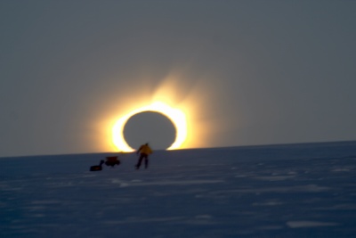
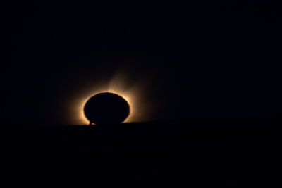
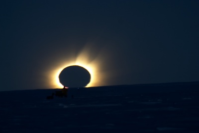
Regarding the eclipse composite, there's a few details that aren't discussed about why the picture looks so weird. First of all, he has the aperture on the camera almost completely closed down to avoid overexposing the image. This results in the moon appearing to have straight sides from the 8 or 9 blades of the iris on his lens. The pictures he used are also slightly blurry, which I think more than the compositing is what's responsible for the ghostly nature of the image.
http://antwrp.gsfc.nasa.gov/apod/ap080503.html
Because of the way the Hubble and many other scientific cameras are built, composites are often necessary to show all the colors together:
http://antwrp.gsfc.nasa.gov/apod/ap071201.html
Today's APOD is a scientifically useful composite that allows astronomers to "see" in wavelengths the human eye can't see:
http://antwrp.gsfc.nasa.gov/apod/ap080505.html
And sometimes they have special aesthetic or education value, like this composite that shows the relative angular sizes of the moon and the much fainter Andromeda galaxy (probably one of my top 10 APOD favorites):
http://antwrp.gsfc.nasa.gov/apod/ap061228.html
One thing that I think is important relative to your point, however, is that composite images should be identified as such, so that viewers aren't misled to the nature of the image. Otherwise, one would be left wondering, "why is Andromeda so clear in that last image, but I can't see it with my eyes when I skygaze at night?"
Regarding the eclipse composite, there's a few details that aren't discussed about why the picture looks so weird. First of all, he has the aperture on the camera almost completely closed down to avoid overexposing the image. This results in the moon appearing to have straight sides from the 8 or 9 blades of the iris on his lens. The pictures he used are also slightly blurry, which I think more than the compositing is what's responsible for the ghostly nature of the image.
"Any man whose errors take ten years to correct is quite a man." ~J. Robert Oppenheimer (speaking about Albert Einstein)
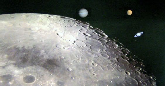
Or this one of mine: http://i189.photobucket.com/albums/z159 ... SATURN.jpg though possible, it likely isn't feasible to take an image of the moon in such sharp focus and have the triple alignment also perfectly focused. But the image shows the relative angular sizes at each planetary opposition in relation to the apparent angular size of the Moon.iamlucky13 wrote: (SNIP) And sometimes they have special aesthetic or education value, like this composite that shows the relative angular sizes of the moon and the much fainter Andromeda galaxy (probably one of my top 10 APOD favorites):
http://antwrp.gsfc.nasa.gov/apod/ap061228.html
Re: Stupid Composite Images
i've been looking at APOD for 3-4 years now and this is my first post on here.orin stepanek wrote:Hi Sputnick! Is this the link you wanted?Sputnick wrote:May 4 http://antwrp.gsfc.nasa.gov/apod/astropix.html
Let's have some real images thanks ... I guess everyone has to have toys, though.
http://apod.nasa.gov/apod/ap080504.html
Orin
i only registered today because of how appalled i was by the above image. if people can't be bothered to retouch an image properly then don't bother to show the retouched version, just PLEASE show the original, there's no way in the world you can make out what the hell is going on.
shocking!
Although I am often disturbed because the "doctoring" (no pejorative intended) of many APOD images is insufficiently described, I find no problem with this particular APOD.
One of the identified links <http://www.moonglow.net/eclipse/2003nov23/index.html> very clearly explains the entire picture-taking and "doctoring" process, the rationale, etc., etc.
I can only wish that a comprehensive and well-written explanation such as that provided by Mr. Bruenjes could somehow accompany each APOD picture.
-
NoelC

- Creepy Spock
- Posts: 876
- Joined: Sun Nov 20, 2005 2:30 am
- Location: South Florida, USA; I just work in (cyber)space
- Contact:
My first thought was that it wasn't a particularly accurate composite, insofar as the moon's silhouette shouldn't be that much darker than the surrounding sky, but it did illustrate the phenomenon nicely.
Oh, and everyone should know that there's a substantial amount of digital processing in virtually every astroimage you see. There is the requirement, for example, to overcome limitations of the equipment (e.g. image noise) by averaging multiple exposures. And let's not forget that most astro images are attempting to illustrate objects with dynamic ranges FAR exceeding the equipment's capabilities. Even the light reflected by the atmosphere has to be removed to truly see what's out there.
Personally, I'm most fond of astroimages that represent the colors of objects much as we would see them if we COULD see them with our eyes - for example, glowing red hydrogen, orange and blue stars, brownish dust obscuring the Milky Way, bluish reflection nebulae, etc. False color imagery is fine as long as it's identified as such. How many folks have been confused by the oddball colors in Hubble images, for example? The instrument is a science tool, and as such very few images have actually been made with wideband visual red, green, and blue filters. So people assemble what is captured by the scientists and assign arbitrary colors.
One thing I've always dreamed of doing is to look through an eyepiece of a truly huge telescope, and actually see the colors of what's out there. Of course, star colors we can see visually from home, but the colors of nebulae and galaxies... No way.
-Noel
composite pictures
Hasn't this been discussed a thousand times before.
it is pretty clear there are composite pictures on this site.
You can't please all of the people all of the time.
Just view... enjoy or not and move on!!!
it is pretty clear there are composite pictures on this site.
You can't please all of the people all of the time.
Just view... enjoy or not and move on!!!
composite images again
I have just read the photographers story which made it all that much more interesting and tells why he put the picture together like he did.
Sometimes you have to spend a bit of time with the images.
Sometimes you have to spend a bit of time with the images.
Re: composite pictures
I was silent when it was posted last year, so I thought it isn't a big deal if I support OP this time.Sue wrote:Hasn't this been discussed a thousand times before.