Good question. The pictures are indeed so different that it is hard to believe that they show you the same object. What we are seeing is the result of data acquisition and processing. In other words, the appearance of the pictures is a consequence of how the photographer photographed his object and what he then did to make the picture more interesting.
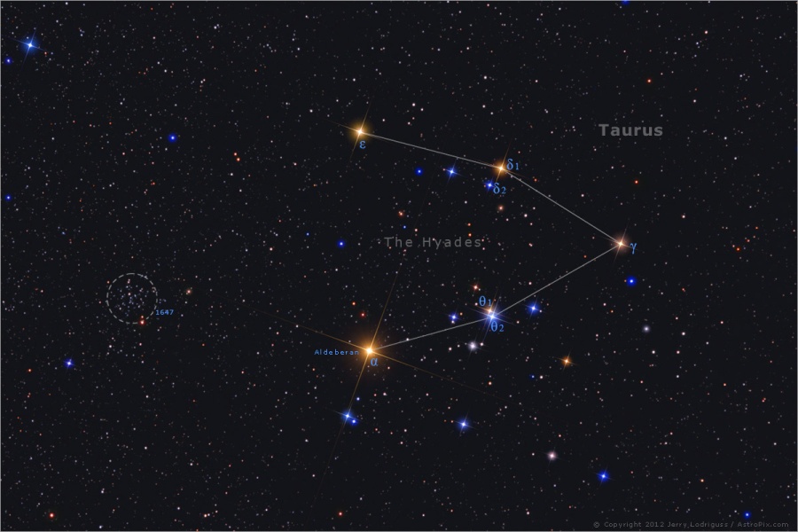
Let's start with Jerry Lodriguss' image. I hope I am allowed to copy it, because Jerry Lodriguss is one of those who is generally not happy about having his pictures copied. But if his picture disappears here, you can always look at it in the APOD from 2012.
The Hyades by Jerry Lodriguss.
When I first saw this picture I was delighted, because I love strong colors in stars, and I particularly like the color blue. But this is exactly where Jerry Lodriguss goes wrong.
The stars of the Hyades are not strongly colored. Yes, bright Aldebaran, which is not even a true member of the Hyades, is obviously orange-tinted. But the other stars, the true members of the Hyades, are pale.
Let's talk color indexes here. The larger the color index, the redder is the star. The color index of Aldebaran is 1.54, which is pretty red. But what about the true members of the Hyades? The reddest of them is Epsilon, ε, whose color index is 1.01. That's not very red for a red giant. But it gets even more interesting when you look at Jerry Lodriguss' image. Can you see that the star
𝛿1 looks redder than ε? But in reality, it's the other way round, because
𝛿1 is marginally redder than ε.
When it comes to the blue stars, it gets worse. First of all, there is not a single very blue star in the Hyades. The blue stars that certainly existed there when the Hyades cluster was really young have run through their brief life cycles and died. The bluest star in the Hyades is
𝛿3, and it isn't labelled in Jerry Lodriguss' image, but it is the blue-looking star to the left of
𝛿1 and
𝛿2..
𝛿3 is a star of spectral class A2IV, with a color index of 0.04. That makes it "okay blue", but not remarkably so.
In some cases Jerry Lodriguss has obviously "imparted color differences" that don't exist. Look at the line of stars at the bottom of Jerry Lodriguss' image. Below Aldebaran is a blue double star, and to the right of this double star is another blue star, and to the right of that blue star is a beige-looking star, and to the right of that one is another blue-looking star. Can you see them?
Well, here's the deal. The beige-looking star is just marginally redder than the stars to its right and its left. The beige-looking star is an F0V-type star with a color index of 0.26. If the Sun suddenly turned as blue as this, the Earth would be inundated with a torrent of (to us) unbearably blue and ultraviolet light.
The star to the left of the beige-looking star in Jerry Lodriguss' picture has a spectral class of A8V and a color index of 0.25. Yes, that is a little bluer, but marginally, marginally so. The star to the right of the beige-looking star has a spectral class of A7V and a color index of 0.21. That's a little bluer still, but again only marginally so. Such a small difference should not show up in a well-calibrated color image.
Conclusion? Jerry Lodriguss has imparted colors and color differences to the stars of the Hyades that aren't really there.
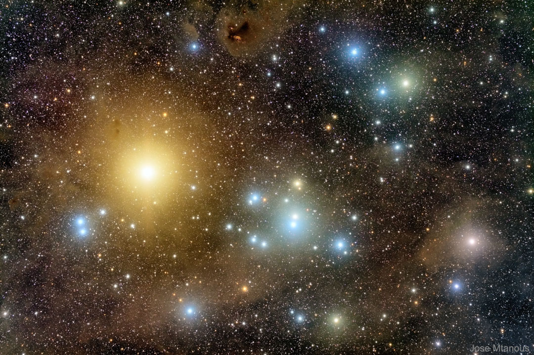
The Hyades by Jose Mtanous.
What about yesterday's APOD? The photographer, Jose Mtanous, has allowed the light from the stars to "bleed" and create huge colored halos. Here too some colors look a little bit strange to me, for example the copper-like color of Gamma,
ɣ, to the far right. But what is most interesting is all the nebulosity that we can see in this image. The photographer has clearly meant to make this dust visible, which is also why the stars have such big halos.
There really is quite a lot of dust in the direction of Taurus, the constellation where we find the Hyades. But most of the dust is probably located at a distance of about 400 light-years, and not so much of it is probably located at the distance of the Hyades, which is about 150 light-years.
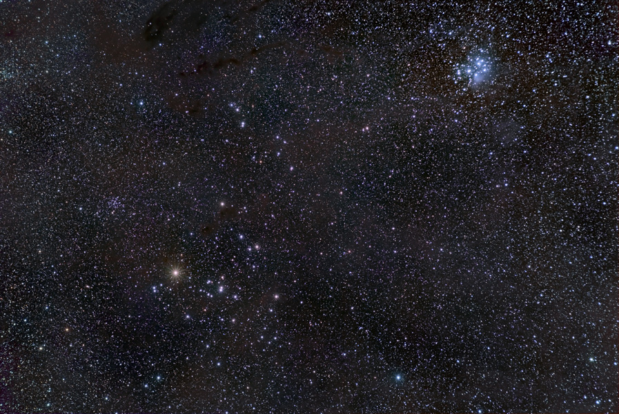
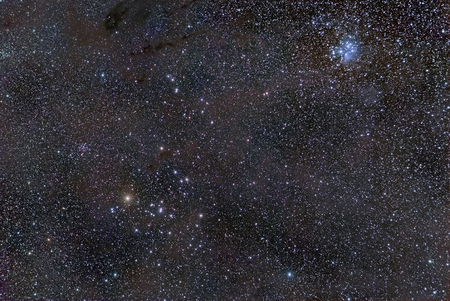
I really recommend two pictures of Alson Wong, which I find splendid.
The Hyades and the Pleiades by Alson Wong.
The Hyades and the Pleiades by Alson Wong, version 2.
Note in Alson Wong's pictures the paleness of the colors of the stars of the Hyades (lower left). Note how the blue color of the Pleiades (top right) stands out compared with the Hyades. And note, too, particularly in the picture at right, how the dust in this whole region becomes visible. You can spot some of the dusty features that are so visible in Jose Mtanous' image in Alson Wong's picture, too.
Hope my explanation helped you!
Ann

 The Hyades Star Cluster