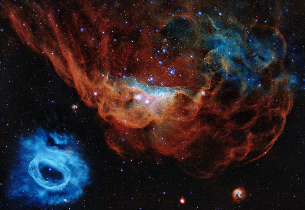
Let's compare the new NASA, ESA, STScI picture of NGC 2014 and NGC 2020 with the old ESO one of the same object. I'm going to make it easy for myself by calling the former image "the left one" (or sometimes, "the new one")and the latter "the right one" (or "the old one").
You can see that the left image is more widefield than the right one. You can see more of the nebulosity of NGC 2014 in the left image. It is clearly a very good thing that we get to see more of the object in the picture.
Still from the movie "Once Upon a Time in the West", directed by Sergio Leone.
Pillars of Creation, tiny-looking standing dark objects, in NGC 2014.
We see many more fine details in NGC 2014 in the new than in the old image. The pale aqua-colored interface between the star cluster and the red part of the nebula is filamentary and full of fascinating details. We can also see many "
pillars of creation" in the nebulosity below, where harsh starlight is evaporating much of the gas and dust, but denser parts of the nebula "remain standing", like the cowboys in the scene from the movie "Once Upon a Time in the West".
You can see that the image to the right is sparkling with background stars. In the left image, the starry background is suppressed and just barely visible. In my opinion, the starry background in the ESO image adds beauty and a sense of a "physical reality" and depth to the image. By comparison, the new Hubble image seems "flat".
Now for the colors of the images. Personally, I strongly prefer the "milder" colors of the old ESO image over the new Hubble Anniversary image. In the ESO image, the colors softly blend inot one another in a way that reminds me of a beautiful painting. In the new image, parts of it reminds me of the result you might get from coloring pictures in a coloring book: You might get sharp, clashing colors that make the objects appear to have no connection with one another.
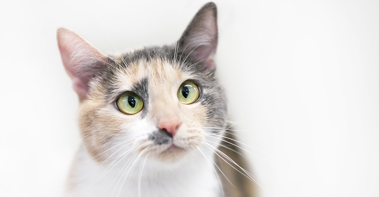
I have posted two cat images, one of an absolutely adorably cute calico cat (at least I think so), and the other one of a dilute calico cat. In the dilute calico, the colors don't clash so wildly.
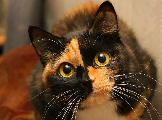
I can't resist showing you a third calico cat, where the colors really clash wildly. In nebulas, I prefer the colors to be more like the dilute calico.
So why is it that the colors of the old ESO image looks like a delicate dilute calico, while the new anniversary Hubble image looks a bit like a Harlequin costume?
My answer is that the ESO image mixed longpass blue, visible and red filters with narrowband Hα and OIII filters. This made it relatively easy to create an image full of delicate, soft colors. In the new Hubble image, the filters used were probably all narrowband ones.
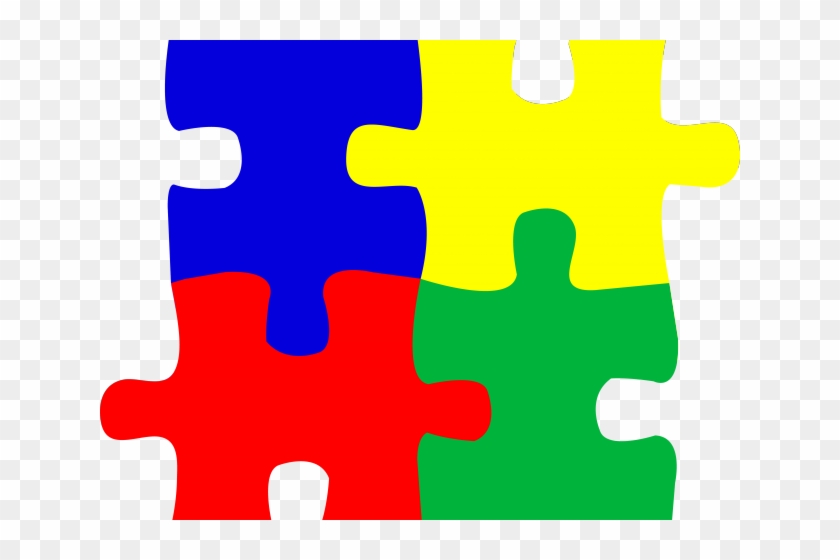
Imagine trying to do a 1,000 piece jigsaw puzzle of a delicately colored scene like the Riverboat Queen by Thomas Kinkaid, using only pieces that are either bright blue, bright green, bright yellow or bright red (or all white). It would not be possible to recreate the delicate colors of Thomas Kinkaide's painting.
The jigsaw puzzle comparison is not quite fair, because it is indeed possible to use a narrowband image to create more nuanced colors than a 1,000-piece jigsaw puzzle of brightly colored pieces would be able to do. For one thing, the Hubble image will most certainly consist of far, far many more pixels than just one thousand.
Even so, I think that the comparison between a narrowband image and a jigsaw puzzle with very brightly colored pieces does tell us something.
Ann
 Hubble's Cosmic Reef


